Most web developers and designers will approach their clients with fancy layouts and sketches. But is this the best approach? I don’t think so.
Of course, showing off pretty interfaces and fancy animations are important, but that is just a stage of the development cycle. One of the biggest problems with this approach is that the customer will get attached to the visuals and will most likely forget about the content.
However, there is a better approach: To build better websites you need to stop thinking about the finished finished product and think about the information the finished product needs to convey.
A website is nothing more than a experience. You need to have an objective and you need to know your public to make the best decisions. Following trends aimlessly will only make your website a inefficient copy of someone elses.
Think about why modern browsers have things like Reader View. The average web experience depends on the style of the pages to be there.
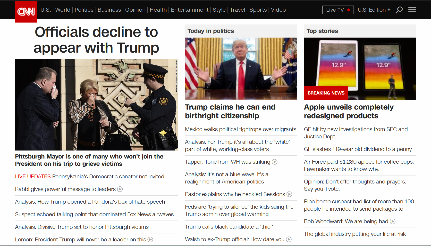
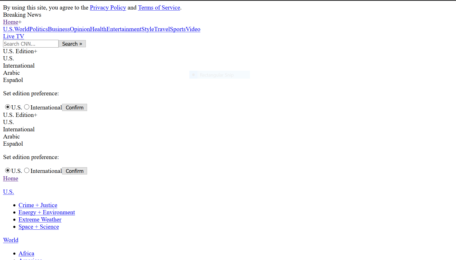
Let’s take a look at an example:


You can’t even tell that the two websites are the same until you start to identify the text and the order. But this is how your browser reads it and this is something you should think about.
Let’s take one more look after we scroll to where the articles start. You can see that the content is there, but there are images over text, bullet points getting hidden, links that look like they don’t belong, and the list goes on.

When this is a real problem?
Did you ever have occasions where you were browsing and then the pages show up completely broken in front of you? Nowadays, this is less frequent, but not too long ago, internet shortages would happen and they would leave clients with nonsensical content in an ugly page.
There is not much you can do about the ugly page part, but you can fix the content structure. This is something HTML5 largely addressed with semantic elements.
Semantic elements exist to represent the content based on what they are rather than how they should look like. No more nested <div> or <table> elements to create layouts and grids.
To write better websites, make them without styles. Just good old content. Don’t place things for the sake of convenient DOM styling. Make structures that matter.
Then how do you make naked websites look good?
It’s true that eventually you will need to make your website look good, so we cannot ignore that part.
There are multiple definitions of what “good looking” is, but in general you want something that will place your rich content in the foreground, placing your brand alongside it and offering enough background information for your visitors to get interested in what you are showing.
If you already have your website structure ready for this, you just need to pick and choose what is important and what is not so important.
You can find better articles on how to make good looking websites, color schemes and animations, but my personal recommendation is to use as little as you can. Save resources, increase performance. You really don’t need all those fonts, animated images and sounds on your website, do you?
If the naked version is incomplete, your rich, polished version will also be incomplete.